Note
Go to the end to download the full example code.
Happy world
In this section, we will learn about plotting data and looking for relationships; fitting straight lines to data; understanding the slope and intercept of the line as parameters in a model; showing that the parameters are the best possible fit to the data. Some useful background material includes Scatter diagrams ; Equation for a straight line ; Differentiation
Plotting the data
Every year since 2005, the World Happiness Report has analysed the results of the Gallup World Poll, which is carried out in 160 countries (covering 99% of the world’s population). The pollsters contact a random sample of people in each country and ask them over 100 questions about their income, their health and their family. These questions include the following question about happiness:

People living in different countries give different answers. In the UK is 6.94, making the UK 17th in the world for happiness. The top ranked country — rather surprisingly given a national stereotype of people who are reserved and don’t express their feelings very much — is Finland, with a score of 7.82. In general, Scandinavian and Northern European countries are ranked highest. The USA is 16th (0.03 points ahead of the UK). China, with a score of 5.59 and at 72nd place, is roughly in the middle of the table of the countries surveyed. Other mid-ranked countries include Montenegro, Ecuador, Vietnam and Russia. Further down the table, we find many African — Uganda and Ethiopia placed 117th and 131st, respectively, Middle Eastern countries — Iran is at 110 and Yemen at 132. The unhappiest country in the world in 2022 is Afghanistan, with an average happiness score of only 2.40.
from IPython.display import display
import pandas as pd
import matplotlib.pyplot as plt
import matplotlib
import numpy as np

# Read in the data
happy = pd.read_csv("../data/HappinessData.csv",delimiter=';')
happy.rename(columns = {'Social support':'SocialSupport'}, inplace = True)
happy.rename(columns = {'Life Ladder': 'Happiness'}, inplace = True)
happy.rename(columns = {'Perceptions of corruption':'Corruption'}, inplace = True)
happy.rename(columns = {'Log GDP per capita': 'LogGDP'}, inplace = True)
happy.rename(columns = {'Healthy life expectancy at birth': 'LifeExp'}, inplace = True)
happy.rename(columns = {'Freedom to make life choices': 'Freedom'}, inplace = True)

# We just look at data for 2018 and dsiplay in table.
df=happy.loc[happy['Year'] == 2018]
display(df[['Country name','LifeExp','Happiness']])
     Country name    LifeExp  Happiness
10    Afghanistan  52.599998   2.694303
21        Albania  68.699997   5.004403
28        Algeria  65.900002   5.043086
45      Argentina  68.800003   5.792797
58        Armenia  66.900002   5.062449
...           ...        ...        ...
1654    Venezuela  66.500000   5.005663
1667      Vietnam  67.900002   5.295547
1678        Yemen  56.700001   3.057514
1690       Zambia  55.299999   4.041488
1703     Zimbabwe  55.599998   3.616480

[136 rows x 3 columns]
Plotting the data
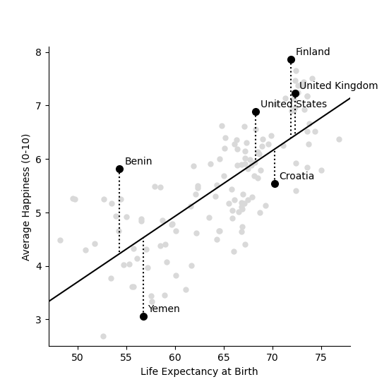
The code below plots the average life expectancy of each of these countries against their happiness (life ladder) scores.
from pylab import rcParams
rcParams['figure.figsize'] = 14/2.54, 14/2.54
matplotlib.font_manager.FontProperties(family='Helvetica',size=11)


def plotData(df,x,y):
    fig,ax=plt.subplots(num=1)
    ax.plot(x,y, data=df, linestyle='none', markersize=5, marker='o', color=[0.85, 0.85, 0.85])
    for country in ['United States','United Kingdom','Croatia','Benin','Finland','Yemen']:
        ci=np.where(df['Country name']==country)[0][0]
        ax.plot(  df.iloc[ci][x],df.iloc[ci][y], linestyle='none', markersize=7, marker='o', color='black')
        ax.text(  df.iloc[ci][x]+0.5,df.iloc[ci][y]+0.08,  country)

    ax.set_xticks(np.arange(30,90,step=5))
    ax.set_yticks(np.arange(11,step=1))
    ax.set_ylabel('Average Happiness (0-10)')
    ax.set_xlabel('Life Expectancy at Birth')
    ax.spines['top'].set_visible(False)
    ax.spines['right'].set_visible(False)
    ax.set_xlim(47,78)
    ax.set_ylim(2.5,8.1)
    return fig,ax

fig,ax=plotData(df,'LifeExp','Happiness')

plt.show()
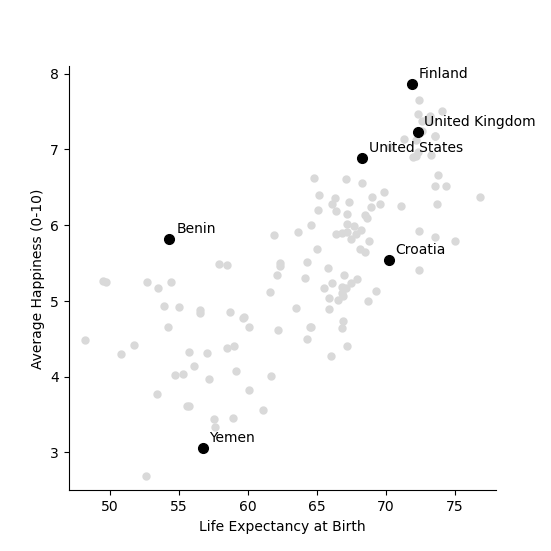
Each circle in the plot is a country. The x-axis shows the life expectancy in the country and the y-axis shows the average ranking of life-satisfaction, on the 0 to 10 scale. In general, the higher the life expectancy of a country, the higher the happiness there.
Drawing a line through the data
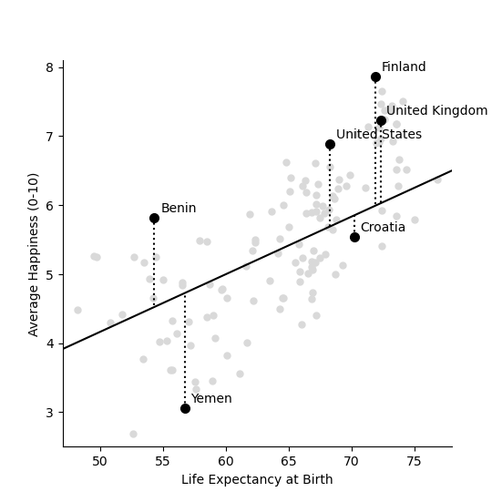
One way to quantify this relationship is to draw a straight line through the points, showing how happiness increases with life expectancy. For example, imagine that for every 12 extra years which people live in a country they are one point happier. The equation for happiness in this case would then look like this,
For example, if the average life expectancy in the country is 60 then the equation above predicts the happiness to be 60/12=5. If the life expectancy is 78 then average happiness is predicted to be 78/12=6.5.
We can draw this equation in the form of a straight line going through the cloud of country points, as shown below.
fig,ax=plotData(df,'LifeExp','Happiness')

# Setup parameters: m is the slope of the line
# And calculate a line with that slope.

m=1/12
Life_Expectancy=np.arange(0.5,100,step=0.01)
Happiness= m*Life_Expectancy

ax.plot(Life_Expectancy, Happiness, linestyle='-', color='black')
df=df.assign(Predicted=np.array(m*df['LifeExp']))
for country in ['United States','United Kingdom','Croatia','Benin','Finland','Yemen']:
    ci=np.where(df['Country name']==country)[0][0]
    ax.plot(  [df.iloc[ci]['LifeExp'],df.iloc[ci]['LifeExp']] ,[ df.iloc[ci]['Happiness'],df.iloc[ci]['Predicted']] ,linestyle=':', color='black')

plt.show()
Try it yourself!
Download the code by clicking on the link below and try changing the slope and the intercept of the line above by changing the values 1/12 and replotting the line. See if you can find a line that lies closer to the data points.
Each of the dotted lines show how far the prected line – which predicts that happiness is one twelfth of life expectancy – is from the data for each of the six highlighted countries. For example, the USA has a happiness score of 6.88 and an average life expectancy of 68.3. The first equation (figure 2b) predicts
Which means that the squared distance between the prediction and reality is
The table below shows the predicted value and the squared distance between prediction and reality for each country. We then sum these squared distances to get an overall measure of how far our predictions our from reality. This is done below.
df=df.assign(SquaredDistance=np.power((df['Predicted'] - df['Happiness']),2))
display(df[['Country name','Happiness','Predicted','SquaredDistance']])

Model_Sum_Of_Squares = np.sum(df['SquaredDistance'])

print('The model sum of squares is %.4f' % Model_Sum_Of_Squares)
     Country name  Happiness  Predicted  SquaredDistance
10    Afghanistan   2.694303   4.383333         2.852822
21        Albania   5.004403   5.725000         0.519260
28        Algeria   5.043086   5.491667         0.201225
45      Argentina   5.792797   5.733334         0.003536
58        Armenia   5.062449   5.575000         0.262709
...           ...        ...        ...              ...
1654    Venezuela   5.005663   5.541667         0.287300
1667      Vietnam   5.295547   5.658333         0.131614
1678        Yemen   3.057514   4.725000         2.780510
1690       Zambia   4.041488   4.608333         0.321313
1703     Zimbabwe   3.616480   4.633333         1.033991

[136 rows x 4 columns]
The model sum of squares is 82.8467
Finding the best fit line
The question is what the ‘best’ line is?
Let’s start by formulating this problem mathematically. For each country \(i\), we have two values: the life satisfaction, which I will call \(y_i\) and life expectancy, which I will call \(x_i\) . For example, when \(i=`USA then :math:`x_i=6.88\) and \(y_i=68.3\).
Now, let’s denote the slope of the line as \(m\) (in the plot above \(m=1/12\)) and repeat the caluclation we made above but with letters instead of numbers. First we note that
The little “hat” in \(\hat{y_i}\) denotes that it is a prediction (rather than the measured value itself, which is \(y_i\)). The squared distance between the prediction and outcome is written as
I want to emphasise here that all I am doing is rewriting the same calculation I did above with numbers, but now with the letters. The reason for doing this is that our aim is to find an equation for the value of \(m\) which minimises the sum of square distances.
The next step is to write out the sum
The above equation is can be written in shorthand form (using the sum notation we met in the section on our average friend as
where \(n=136\) is the number of countries.
We want to find the value of \(m\) which minimises this sum of squares. But how do we do this?
A diversion in to differentiation
This part of the webpage assumes you have studied differentiation and you understand that the derivative is about finding an equation for the slope of a curve. When the derivative is zero, the slope is zero.
To refresh your memory, imagine you are asked to find the value of \(m\) which minimises the function \((4-2m)^2\). To solve this problem, you can first multiply out the brackets to get
You can then take a derivative in order to calculate the slope of the function, as follows.
We then solve this equal to zero, because the function is a minimum when it has slope zero.
Problem solved.
Think yourself!
Use the derivative to find the minimum of
Although the algebra is more complicated, we can use exactly the same logic to solve the problem above, of finding the value of \(m\) which minimises this sum of squares. We first take the derivative
Although this particular step involves alot of algebra, notice that we are doing exactly the same as in the example above. Another thing that I find can confuse students (when I teach this in statistics) is that we differentiate with respect to \(m\). In school, we often use the letter \(x\) for the variable name and \(m\) for a constant. Here it is the other way round. The data \(x_i\) and \(y_i\) are constants (measurements from countries) and \(m\) is the variable we differentiate for.
We now write the sum above in shorthand as
and we solve equal to zero (to find the point at which it is minimized, and the slope is zero) to get
Moving the \(m\) to the left hand side gives
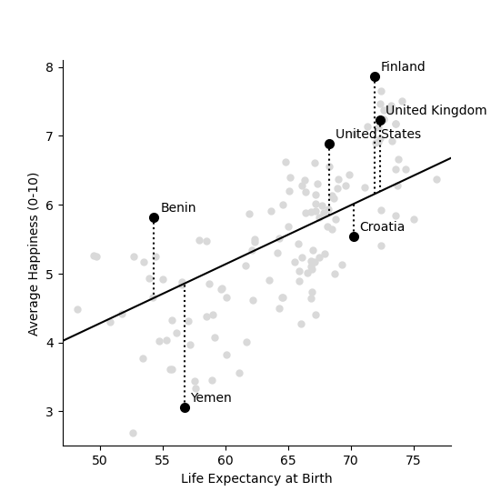
Lets now use our newly found equation to calculate the line that best fits the data.
df=df.assign(SquaredLifEExp=np.power(df['LifeExp'],2))
df=df.assign(HappinessLifEExp=df['LifeExp'] * df['Happiness'])

m_best = np.sum(df['HappinessLifEExp'])/np.sum(df['SquaredLifEExp'])
print('The best fitting line has slope m = %.4f' % m_best)
The best fitting line has slope m = 0.0856
Our intial guess of \(m = 1/12 = 0.0833\) wasn’t so far away from the best fitting value. But this new slope is slightly closer to the data. We can now plot this and recalculate the model sum of squares
Life_Expectancy=np.arange(0.5,100,step=0.01)
Happiness= m_best*Life_Expectancy

fig,ax=plotData(df,'LifeExp','Happiness')
ax.plot(Life_Expectancy, Happiness, linestyle='-', color='black')
df=df.assign(Predicted=np.array(m_best*df['LifeExp']))
for country in ['United States','United Kingdom','Croatia','Benin','Finland','Yemen']:
    ci=np.where(df['Country name']==country)[0][0]
    ax.plot(  [df.iloc[ci]['LifeExp'],df.iloc[ci]['LifeExp']] ,[ df.iloc[ci]['Happiness'],df.iloc[ci]['Predicted']] ,linestyle=':', color='black')

plt.show()

df=df.assign(SquaredDistance=np.power((df['Predicted'] - df['Happiness']),2))

Model_Sum_Of_Squares = np.sum(df['SquaredDistance'])
print('The model sum of squares is %.4f' % Model_Sum_Of_Squares)
The model sum of squares is 79.9469
Again, this sum of squares is slightly smaller than the value we got above for \(m = 1/12\)
Including the Intercept
An equation for a straight line usually has two components a slope \(m\) which we have already seen and an intercept \(k\), which so far we have assumed is zero. We can write the equation for a straight line as
We now look at how we can improve the fit of the model by including this intercept.
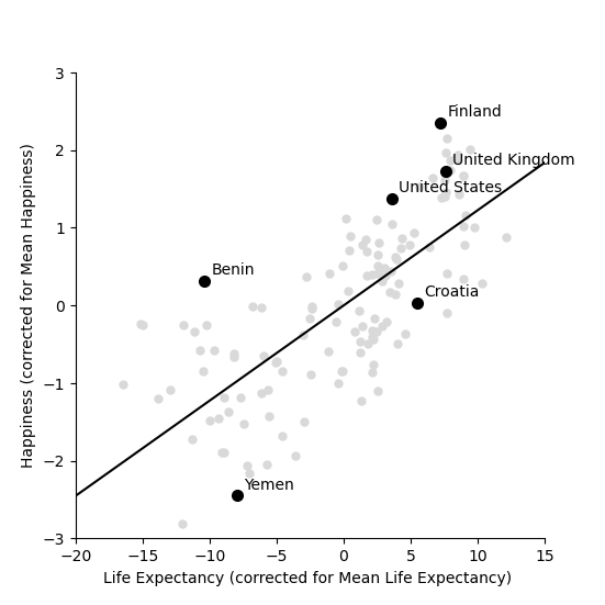
We start by shifting the data so that it has a mean (average) of zero. To do this we simply take away the mean value from both life expectancy and from happiness. Then replot the data
df=df.assign(ShiftedLifeExp=df['LifeExp'] - np.mean(df['LifeExp']))
df=df.assign(ShiftedHappiness=df['Happiness'] - np.mean(df['Happiness']))

fig,ax=plotData(df,'ShiftedLifeExp','ShiftedHappiness')
ax.set_ylabel('Happiness (corrected for Mean Happiness)')
ax.set_xlabel('Life Expectancy (corrected for Mean Life Expectancy) ')
ax.set_xticks(np.arange(-30,30,step=5))
ax.set_yticks(np.arange(-5,5,step=1))
ax.set_xlim(-20,15)
ax.set_ylim(-3,3)
plt.show()
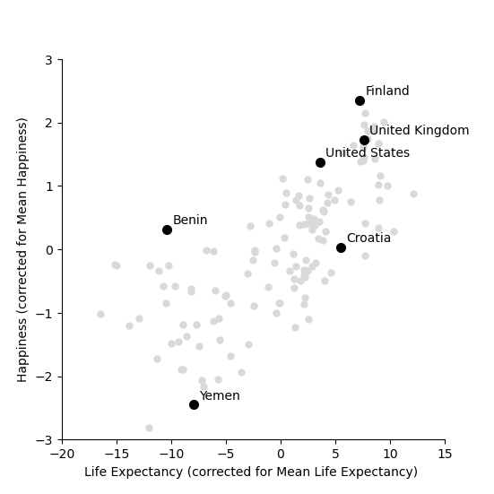
This graph shows us that, for example, Yemen is almost -2.5 points below the world average for happiness and has a life expectency 8 years shorter than the average over all countries in the world. The United States life expectancy is around 3.5 years longer than the average and the citizens of the USA are about 1.3 points happier than average. It is worth noting that the correction is for country averages and does not account for the size of the populations of these various countries. It does however give us a new way of seeing between country differences.
Let’s now try to find the best fit line which goes through these data points.
df=df.assign(SquaredLifEExp=np.power(df['ShiftedLifeExp'],2))
df=df.assign(HappinessLifEExp=df['ShiftedLifeExp'] * df['ShiftedHappiness'])

m_best = np.sum(df['HappinessLifEExp'])/np.sum(df['SquaredLifEExp'])
print('The best fitting line has slope m = %.4f' % m_best)

Life_Expectancy=np.arange(-50,50,step=0.01)
Happiness= m_best*Life_Expectancy

fig,ax=plotData(df,'ShiftedLifeExp','ShiftedHappiness')
ax.plot(Life_Expectancy, Happiness, linestyle='-', color='black')
ax.set_ylabel('Happiness (corrected for Mean Happiness)')
ax.set_xlabel('Life Expectancy (corrected for Mean Life Expectancy) ')
ax.set_xticks(np.arange(-30,30,step=5))
ax.set_yticks(np.arange(-5,5,step=1))
ax.set_xlim(-20,15)
ax.set_ylim(-3,3)

plt.show()
The best fitting line has slope m = 0.1226
This line appears to fit better than the one we fitted earlier! It lies closer to the points and better capture the relationship in the data. To test whether this is indeed the case we can calculate the sum of squares between this new line and the shifted data. This is as follows
df=df.assign(Predicted=np.array(m_best*df['ShiftedLifeExp']))
df=df.assign(SquaredDistance=np.power((df['Predicted'] - df['ShiftedHappiness']),2))

Model_Sum_Of_Squares = np.sum(df['SquaredDistance'])
print('The model sum of squares is %.4f' % Model_Sum_Of_Squares)
The model sum of squares is 71.7665
This new line through the data is better! It has a smaller sum of squares.
The mean values are calculated as follows
Using this notation, the equation for the line through the data is
Just to remind you about the notation. The predicted value has a hat over it, while the mean values have a bar over them. We can rearrange this equation to get
Notice that this is an equation for a straight line, so we can write
Let’s apply this to data and plot the line again
k_best = np.mean(df['Happiness']) - m_best*np.mean(df['LifeExp'])

Life_Expectancy=np.arange(0.5,100,step=0.01)
Happiness= m_best*Life_Expectancy + k_best

fig,ax=plotData(df,'LifeExp','Happiness')
ax.plot(Life_Expectancy, Happiness, linestyle='-', color='black')
df=df.assign(Predicted=np.array(m_best*df['LifeExp']+k_best))
for country in ['United States','United Kingdom','Croatia','Benin','Finland','Yemen']:
    ci=np.where(df['Country name']==country)[0][0]
    ax.plot(  [df.iloc[ci]['LifeExp'],df.iloc[ci]['LifeExp']] ,[ df.iloc[ci]['Happiness'],df.iloc[ci]['Predicted']] ,linestyle=':', color='black')

plt.show()

print('The slope of the line is m = %.4f and the intercept is k = %.4f' % (m_best,k_best))
print('An increase in life expectancy of %.4f years is associated with one extra point of happiness' % (1/m_best))


df=df.assign(SquaredDistance=np.power((df['Predicted'] - df['Happiness']),2))
Model_Sum_Of_Squares = np.sum(df['SquaredDistance'])
print('The model sum of squares is still %.4f' % Model_Sum_Of_Squares)
The slope of the line is m = 0.1226 and the intercept is k = -2.4252
An increase in life expectancy of 8.1580 years is associated with one extra point of happiness
The model sum of squares is still 71.7665
Now we have it. By shifting back to the original co-ordinates we can find the best fitting line through the data. Notice that the sum of squares is unaffected by shifting the line back again, since the distances from the points to the line are unaffected.
We can say (roughly speaking) that for every 8 years of life expectancy country citizens are about 1 point happier on a scale of 0 to 10. It isn’t the whole truth (see the word of warning below), but it isn’t entirely misleading either.
A word of caution
Although there is a relationship between these two variables, this does not mean that life expectancy causes happiness.
In the book you can learn more about the dangers on confusing correlation for causation.
Total running time of the script: (0 minutes 0.713 seconds)